
New Tim and Ray Logos: You Decide!
August 18th, 2008
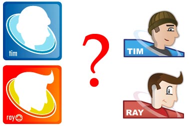
 Ray and I have a difference of opinions on how the new Tim and Ray logos should be implemented, so I thought it would be fun to let you guys decide. Should they replace the old ones? Should they only apply to comics from this day forward? Vote below!
{democracy:12}

Okay, I just have to comment on everything apparently. I chose the first option. IMO, both logos are pretty awesome. I like the style of the first ones, but I think the newer ones are better suited for what they’re used for.
I actually prefer the “old” ones. I feel something awkward from the new ones; the background thing? The ring around the caricatures may also be out of place on the new ones.
I feel the older logos are part of what gives 2Pstart! it’s uniqueness among the world of webcomics. The “guest” logos in particular have been nice to see pop up now and then.
But hey, change is only bad until you get used to it, right?
I personally don’t like the old logos. They matched well with the old site we had (blue and green mostly), but never felt right here. In fact, I think it’s the only thing we didn’t upgrade graphically a year ago when we changed the site. Anyway, it looks like they won’t be going away, they’ll just stay in the past!
I didn’t like the new logos at first, but the more I look at them, the better they seem.
As of right now, I don’t really like the new logos. Perhaps you should test it out on your next comic. Then I’d be able to make a clear decision.
And I’ve never seen the site’s old look. Is there some way that I could see it now?
I voted for the first option, Even though That means that I have to make a new one icon for my guest comic that I have in the ‘prototype’ stages at the moment… Too bad I can’t draw myself from a profile view to save my life 😉 Here’s hoping…
I voted for the third option, but I don’t actually hate it. I just think the old ones are simpler and — just, nicer.
Just put them on the new ones. The old icons were apart of the site when the old comics were put up. No point in changing history.
I like the old ones much better. I like how simple they are. They dont take away from the comic, or deviate the readers attention. And they look better.
Ray’s smirk reminds me of Sonic. Coincedence?
I like both logos! 😀
I do like how both of them are very similar. Obviously they’re drastically different, but both have that ring, and both have Tim/Ray’s profile on them, and both have the same colors for Tim and Ray and both have names. Though Ray’s new one doesn’t have his funky raybob logo on it…
Not a chance…
I know…. I was a little disappointed that there wasn’t much room for it anymore…. I may end up sticking it in somehow eventually anyways.
Does it look ugly above your name or something? It would fit there.
Yeah, it just looks really out of place. I’ll make it work somehow though, eventually….
Maybe you could replace the ‘A’ with the logo…XD That would probably look even worse huh?
Make the new ones sharper and then only on comics. Maybe add a pen on one of them so user can distinguish who is the artist.
You’re smiling too much! But they’re not that bad.
Hey Ray, I’ve been wondering, is your logo of something? Because I can sort of see a smiling face. Or is it just a logo?
Just a logo – I’ve used it since 1997.
Interesting. Anyway, it’s very nice, and I like it!
i say keep the old logos for the old ones. it leaves something for people to notice how youve changed over time and gotten better. putting the new logos on the old comics would be like ray redrawing the old comics every time his art style progresses
The old logos are a lot more “professional”, I guess is the proper term..
Although the new ones are nice, I think should be used in a minimalistic way..