
MetaRidley
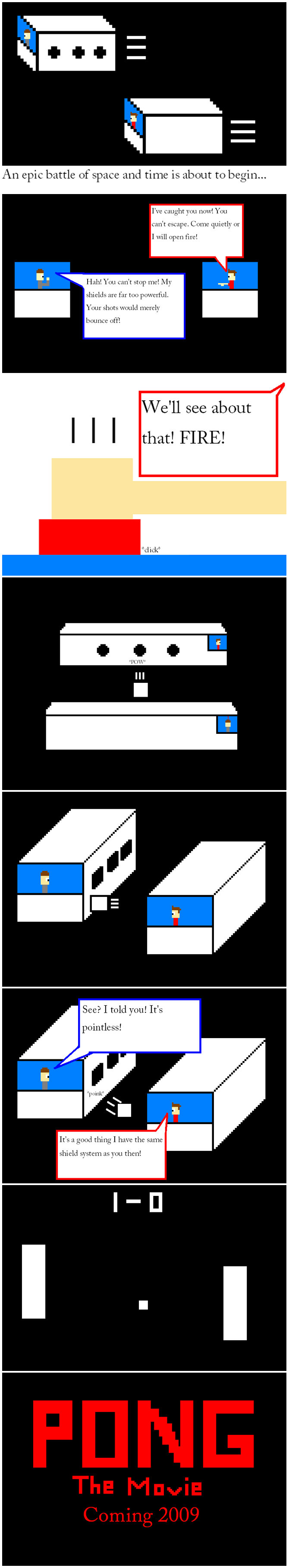
 I was having a conversation with Ray one day about making websites. I told him that I had great ideas, but I just wasn’t that good at making comics. I then told him about the idea for this comic. After hearing it, Ray said, “Go for it.” Unfortunately, I still couldn’t make a nice looking comic by myself, and I didn’t know anybody who could make it for me. Later that day, I was watching Code Monkeys. That’s when something clicked in my mind. I thought back to Tim and Ray’s podcast about Megaman 9 and it’s 8-bit graphics. I then thought to myself, “I can make an 8-bit comic, and still have it look nice!”
This comic was made in Paint with all but one of the default colors. I actually put another video game reference in the comic. It’s pretty obvious, but I want to see if anyone noticed it. Who knows? Maybe I can eventually make 16-bit comics!
 As a big fan of retro games, I fell in love with 8-bit Tim and Ray! MetaRidley sent along the logo first and after my response, sent along the comic as well. I made some minor modifications to his logo characters that aren’t reflected in the comic to make us a little less blocky. Now I just need a game programmer to create an NES RPG using Tim & Ray’s 8-bit sprites!

I love the icon! Great job!
Wow, great idea for a comic. How long did it take you to make?
That’s awesome. Nice icon too.
Great Job Meta!!!
The icon is awesome
It took me about an hour or two. It would have taken even longer if I had to make the icon myself. That’s what I was referring to in my first comment. Thanks Ray!
nice meta.
You should make more comics and start a small site. If your comics are all this good you could go places.
Wow! Thanks guys! I was worried that some people wouldn’t get the joke.
Traitor! (issue one reference) I made my icon by hand! And you like his Purple(ish) one better…
I may be off on the color, I’m slightly colorblind and Purple gives me a harder time than yellow, orange, red, blue, etc.
besides, Mine took longer… about a day’s worth of hours went into it…
I still liked it, and it looks like Dj and I have some rivals in the comic biz…
we should seriously have a 2P Start! convention
I guess that no one noticed the reference in panel 4. Tim has a tiny Metal Gear Solid ! above his head.
Nice comic! As a graphic designer, one rule that I know I must follow is that if I’m “going for something,” I have to go all the way. What I mean by that is that you’re doing this 8-bit thing (which is interesting and effective!) but you’re using this completely out-of-place serif typeface for the copy… I think the whole thing would be more cohesive if you use a “pixelated” sort of typeface. Google “pixl” by k-type – it’s free, and I think it fits your 8-bit aesthetic well. (I’m not associated with the designer of the typeface in any way, blah blah, just trying to make a friendly suggestion!)
I like how Tim is holding a Dr.Pepper in the logo.
I think this calls for a “Fan comics” section in the extra’s page.
*Tim and Ray sigh, as they realize that I just suggested more work for them* 🙂
That’s another little reference I threw in there.
nice love the 8 bit
Nice job Meta Im glad to call you my neighbor
Not really 8-bit, (8-bit sprites have a maximum of 3 colors. 4 if you count “transparant” as a color.) but at least the “bad graphics” style goes well with the concept of the comic.
The joke is awesome, and really original! I can’t believe no one has thought about this one before!
I thought the video game reference was going to be something like Echochrome, because the 4th panel reminds me of that for some reason. Oh well. Very nice comic! I like the style and I love the joke! Good job. 🙂
I laughed.
Meta, AWESOME job. I think this comic is great!
I didn’t know that buttons went “dick”…
Heh, it says “click”. The c and l are just really close together, which makes it look like a d.