Smash Bros: It’s Time to Have a Talk

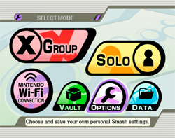
Imagine you just popped in Smash Bros. Brawl, and then you press start at the title screen. Well, here’s the main menu you would see next:

How do you feel about this?
As a Graphic Designer, I’ve thought pretty hard about the alignment, the colors, the symbols, the fonts, the white space, and the consistency: and I end up wondering things like this:
• Why is there an X for Group? Is that supposed to mean multiplication?
• Why does the Wi-Fi button look nothing like the other buttons?
• Does this menu really say “Smash Bros?”
• Why do the borders have an uneven and inconsistent thickness?
On the other hand, It also works quite well, and I also end up thinking:
• The buttons must be gigantic so that selection is easy with the Wii Remote.
• The Wi-Fi button looks pretty similar to the logo used on game cases.
• The size of the individual button is determined by its importance.
• Perhaps it will all make a lot more sense once everything’s unlocked..?
• Smash Bros. Menus generally reflect the style of the console it’s on.
Perhaps I simply need to get used to it. Plus in the long run, is it really going to change what we think of the game itself?


Well since it still hasn’t been released there is always the chance that they changed some of it right…? But yeah but N want everything to go with the Wii’s white motif so until then get used to this odd whiteness in more games. Wii white is the new xbox black.
Plus it could be placeholder art. It looks to me a lot like placeholder art.
If this is the final menu screen, I’m not buying the game.
Uhh, in Japan SSBB is called “Super Smash Bros. X”, hence the “X” on the “Group” icon
Tim, I have to disagree there…
From a graphic designer’s standpoint, I can see why you wouldn’t want to buy it…
But from a game player’s standpoint, shouldn’t it be the quality of the GAME that determines your purchasing decision?
Yeah, I’m just kidding. I couldn’t care less what the menu looks like (even though I do think it’s really horrible). I’m more upset that Waluigi won’t be playable.
Meh, it’s just a menu to me.
Inconsistent interfaces are annoying, ugly, and harder to use. The uneven borders of the buttons look kinda cool, but the shapes and placement of the buttons is just silly.
Windows Media Player and Internet Explorer 7 suck in a similar manner.
Heh, I’ve thought many times about the way that menu is supposed to work. I honestly don’t like it. I liked the straight-forward versions of the last two games. Up and down, hit A to select, B to go back. Simple, consistent, hard to get lost. But this menu is still throwing me for a loop. I really hope they do change the look… or at least redefine the layout.
As for Waluigi, why! Why no Waluigi! *does his Waluigi laugh then sighs…* I’m sad now..
Lol, I love the “Solo” button. If you look behind the word it looks like the little figure is hanging his head in shame. Because we ALL know that playing solo in SSBB means that you are worthless and have no friends.
I wish they had something more like the ssbm menu screen.
i wish i was a sexy as him
OMG LOL Look at this hilarious website I found.
http://mojo.rick-gardiner.com/en_us/index.html
And especially this song:
SCB:B
(Just guess what the C stands for lol…)
http://mojo.rick-gardiner.com/en_us/music/music01.html
Hmm… The menu looks like something out of Ouendan.
It honestly reminds me of the Kirby Racing Game… and I don’t so much consider that to be a good thing.
The menu reminds me quite distinctly of another Hal Labs game I think most of us know all too well about…
…Kirby’s Air Ride, anyone?
Well, it’s all good to me. I am one of those hopeless freaks who actually thought that game was absolutely amazing.
P.S. Seems Xeno beat me to it >_<
Krby Air Ride was the first thing that came to mind when I saw it. Honestly, I could care less though, I’d buy it if the Menu’s looked liked they belonged on the NES, as long as the games the same 😀 .
If SSBB had an NES-looking background, that would actually be really freakin’ sweet O.O