
Mario Kart Wii Box Art Analysis
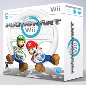
 The above image is the confirmed final box art for Mario Kart Wii (it comes packed with the Wii Wheel, hence the large box). We can assume the actual case for the disc has the same artwork on it. I can’t say I’m entirely sold on the image. The logo is acceptable even though the ‘Mario Kart’ has some sharp lines that contrast a bit with the Wii logo. The blue circle is a nice touch as it matches the back of the Wii Wheel itself (and reminds me of the Wii Shop Channel’s blue loading ring). I think the huge Wii Wheel in the background is overkill though. If someone was curious about why the box was so big, they’d see the logo in the corner explaining that it comes with a Wii Wheel. Plugging the peripheral so prominently on the cover seems like a waste of space (and this box has plenty of space). And that brings me to what is most wrong with the box, Mario & Luigi. While Luigi fans may be happy to see that the less famous plumber is getting a pretty notable spot on the cover, it’s still pretty lame that they are floating in a driving position holding a…oh, for crying out loud, more Wii Wheels?!?!? I’m counting 4 Wii Wheels on the front cover alone, not to mention the symbolic blue circle that can be interpreted as a reference to the wheel. So we’ve got 4 Wii Wheels and 0 Karts. It seems to me that with the minimalistic box art, Nintendo is going after the casual market a bit with this game. Mario & Luigi aren’t really driving karts, they’re playing the game, holding the controller, pretending to drive karts. The only karts on the box art are the shadows of karts under the floating drivers which a lot of people won’t even notice. My biggest problem with this is that the actual game includes all-new vehicles like motorcycles, and has mid-air tricks too. Love ’em or hate ’em, these new additions should get some sort of attention on the box as they are firsts for the franchise. And let’s not forget that this will be the best looking Mario Kart game to date as well as the first online console version of the game. A game with 12-player online races should probably have more than two characters on the screen…and actual vehicles…and less Wii-mote accessories…and a real background. I see what they’re trying to do, but it just doesn’t work. Imagine Super Mario Galaxy with just a white background with Mario shaking a Wii remote. Boring, just like this box art. What are your thoughts?

Now that you’ve mentioned all that…..The box art kinda sucks. Hopefully the game box inside is decent(although I’m doubting it), it might even just come with a small paper case like wii sports and link’s crossbow training(at least I think link’s crossbow training came with a paper disc holder).
It BETTER NOT come with a sleeve! I’d take a real case over the Wii Wheel any day (well, maybe not, but if the box art was better, I’d consider it). I can understand for Link’s Crossbow Training since they were selling the Zapper and included a free game. This time, it’s the other way around.
I second the sentiment about no paper sleeves. Not only does it not fit in with any of the other games, and is often harder to remove the disk and manual contained inside, but I’ve yet to be able to open the paper sleeve without damaging the outer artwork (due to the fact that they tape it up). Proper cases FTW! 🙂
I agree too about the minimalistic box artwork. I hope the actual box is nicer. Then again, it’s wouldn’t expect it to be a make or break aspect for people who are going to potentially buy the game.
Ditto on hating sleeves! They totally don’t work on my DVD/game rack.
@Tim: Well I know there’s a website that has downloadable cover art for games, including full fan-made cover art for wii sports and link’s crossbow training that fit normal cases. And if memory serves you can buy blank wii game cases somewhere on nintendo.com. I’ll post the link to the cover art site later(I’m at work now).
If that art work is on the plain game case, it will look retarded. A special artwork for the Wii Wheel, it isn’t too bad, but not as the game case.
Is there an easy place to get white dvd cases without ordering a zillion of them?
Thanks, dj.
@Andrew: Nintendo(If memory serves), you can order like 1, 3, or 7 or something like that, I don’t remember. I’ll try and find out later .
.
Thanks DJ, I’m actually SOOO anti-sleeve that I went to the trouble of making proper cases for Wii Sports and Link’s Crossbow Training. In fact, my proper case obsession is sort of what led to me and Ray meeting. I ran a little contest over at playwii.com and Ray was one of the winners. From there we kept in contact and the rest is history.
Actually, I think the site I was talking about was thecoverproject.net , not sure, I’ll look into it later, and the cases.
If you look closely, you see that in the top right corner there’s a symbol of a real case with a disc in it.
I know what happens in this game.
We play as Mario franchise characters who play the Nintendo Wii system to play Mario Kart!
:O
@HTML_Earth:It can easily be construed as a disc sleeve, especially considering the way the disc is coming out of it. I guess we’ll find out eventually.
@Everyone: Here is where you can buy blank Wii game cases, directly from Nintendo. I know you can also find blank DS, and Gamecube game cases too. And here is where you can download the inserts for the cases(Wii sports etc.).
Yeah, I pretty much agree with everything Tim said, and for the record, I still think the Brawl art kinda sucks too. (Heck, I don’t even like the NAME “Brawl” that much, but don’t bother consoling me, I’ve long since dealt with it.)
I have bad feelings about Nintendo’s future… I don’t want to admit it, but I may eventually be one of those jerks who currently say they’ve “outgrown” Nintendo or something. …Naw, they’ll probably do something awesome with Wii 2 that I won’t be able to resist. Still… the big franchises will be seeing some major changes… hopefully good ones.
1) Tim, you’re absolutely right “Nintendo is going after the casual market”
2) For the rest of us, we know it is Mario Kart and will buy it regardless of how awful the box art is.
3) If nothing else, the Wii Wheel will provide a comical way to watch people try to play other games it’s not intended for. Specifically I’m thinking Guitar Hero at the moment.
I’m pretty weirded out by the last couple Nintendo covers. The art for Brawl and Mario Kart look so very fanmade.
I like the art for Brawl personally. Looks nice to me.
If you look at gonintendo, it definetely looks like a case. ‘Cause y’know, you can’t open a sleeve like that.
@HTML_Earth: I don’t know man, I guess we’ll just have to wait and find out. But I’m not getting my hopes up.
That’s simply an Icon. It doesn’t mean anything to the actual container of the disk. I assure you it will be a sleeve because the game is already in a box, just like WiiSports was already in the Wii’s box and Link’s Crossbow was already in the Zapper box.
Putting it in a normal case when it’s already in another box is cost ineffective. They save money putting it in a cheap cardboard sleeve as opposed to the plastic case. If they didn’t have to protect the CD in the stores using the plastic case, they would have all the games in cheap cardboard sleeves. That’s the logic behind it.
And BTW, I hate the sleeves as well, but I have a space issue with all the plastic cases (I take my Wii with me a lot). So I’m stuck with the sleeves. 🙂
Oh yeah, and (sorry for double posting) the box art fits with the Wii’s marketing policy. Someone said on this site before how when you go to Nintendo’s site, you see everyone playing the game instead of actual gameplay shots. This runs in the same vein – Mario and Luigi are playing the game!
And I kind of like the little cart shadows under them. They’re “in the game”, sending people the subliminal message that the game is very engaging. They could have done the shadows a little better (soft edges, put in the characters’ shadows…).
To be honest, I really don’t have much of a problem with the Mario Kart Wii boxart, although I can understand some of the complaints.
The Brawl boxart is decent, but they could have done a lot more with it. I’ll probably be making the ultimate replacement cover at some point….
Tim and Ray holding Wii wheels and floating over Kart shadows?
This is a post back from a while up the replies, but i’m from the UK and when i bought my shiny new Wii a while ago Wii sports inside came in a DVD case. I spent half an hour reading these posts to myself trying to think what the cardboard holder looked like, before realizing I never had one :D.
Onto the case itself it looks good, it is a lot minimalistic but that’s the way japan is.
Oh… I stand corrected – somewhat. My explanations still holds true in the US. It’s you English people that throw off the equation! 🙂
No, but seriously, someone at Nintendo of the UK must hate the cardboard sleeves as well. Nintendo of America just wants to save money.
I think you complain too much
Hey Pie,
Shut your piehole. Just kidding, I just had to say that. No, I try not to complain, but I’m not sure how to do an in-depth analysis without critiquing each part. While it may come off as a complaint, I’m just trying to be thorough. I can’t wait for this game though!
@ Ransom; Yes, it definitely looks fanmade… ugh. Even the U.S. Melee boxart was better. (with the Japanese art being far superior)
I would have been OK with some kind of minimalistic cover as long as it had some decent style. (I still don’t really care THAT much, but you have to admit, when you see the game box sitting there, (in the future) it’s not going to look very appealing, at least not to newcomers to the series. Give us some style!)
@ Ray; Please allow us to use your ultimate replacement cover! (for Brawl that is)
It’s not the box you play with (but it’s also fun) so it doesn’t matter. The game’s going to be cool so everything’s fine.
In Australia both “Wii Sports” and “Link’s Crossbow Training” come in a proper white case. I guess it’s compensation for the fact that we have to wait six months to play any of these games.
For me, the links crossbow was in a paper cover, and wii sports was also. The box looks big enough for a case. And that reminds me, the links crossbow game needs to be a full game, it was pretty fun 😀